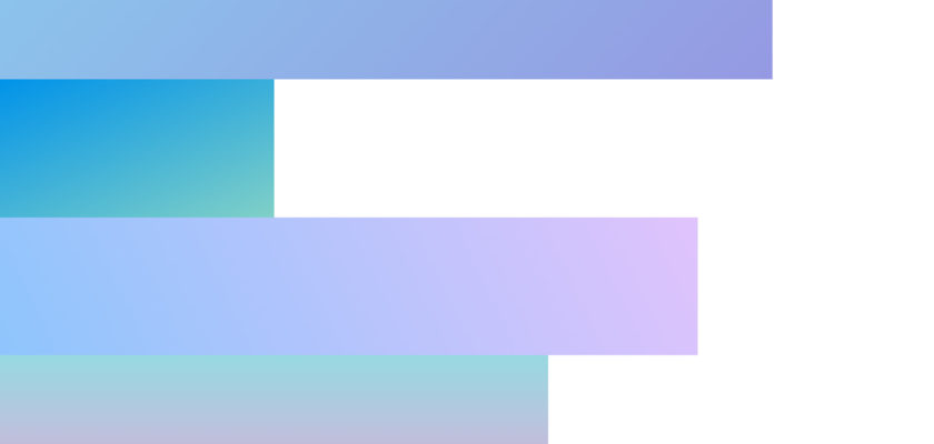
A simple striped gradient CSS Animation for use in website intros and web presentations.
See the Pen
CSS Website Background Animation Intro by Devtutorials4u (@devtutorial4u)
on CodePen.
CSS and HTML
body {
  margin-top:0px;
}

.line {
      position: absolute;
			left: 0;
			height: 25%;
      animation-fill-mode: forwards !important;
}

#line_1{
  background-color: #8BC6EC;
background-image: linear-gradient(135deg, #8BC6EC 0%, #9599E2 100%);
			animation: draw 4s 0s linear;
		}

#line_2{
      top:25%;
			background-color: #0093E9;
background-image: linear-gradient(160deg, #0093E9 0%, #80D0C7 100%);

			animation: draw 4s 2s  linear;
		}

    #line_3{
      top:50%;
			background-color: #8EC5FC;
background-image: linear-gradient(62deg, #8EC5FC 0%, #E0C3FC 100%);

			animation: draw 3s 1s  linear;
		}

    #line_4{
      top:75%;
			background-color: #D9AFD9;
background-image: linear-gradient(0deg, #D9AFD9 0%, #97D9E1 100%);

			animation: draw 2s 2s  linear;
		}


    @keyframes draw{
			0%{
				width: 0%;
			}
			100%{
        width: 100%;
      }
    }


  <div id="line_1" class="line"></div>
    <div id="line_2" class="line"></div>
    <div id="line_3" class="line"></div>
    <div id="line_4" class="line"></div>


